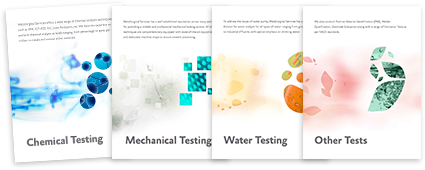
Categorization
Over a period of time Metallurgical Services built up a large portfolio of services. When we first got to work thinking about how to design for them it became very clear that these services would be easier to find if they were categorized as opposed to the flat list they were presented to us in.
Indentity
We found the earlier logo was misused in many places with a mix and match of styles brought on by the constraints of computer based publishing. That's why we chose to start fresh.
 Metallurgical previous identity was designed in the early ‘90s so it reflected the thinking of the time.

The first thing we did is settle on a typeface, we chose Absara Sans a typeface with a rough but sturdy metal cut look. This is especially noticeable in the lowercase ‘a’ and ‘g’.
We left the rest of the branding open and abstract.
Website
As part of our rebranding effort for Metallurgical we took on the redesign of their website.
Their previous website had helped them develop many new contacts and their largest problem was that it was not easy enough for them to find the information on the website.
We solved their problem by categorizing the services & integrating the contact form onto every page.
Rollover the Image

