Categorization
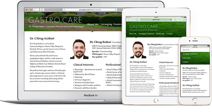
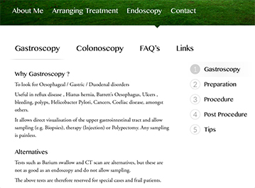
The content had nine different sections. We sat with the client to group the information together into four simple and easy to understand links.
We chose our words very carefully and resisted using clichés like ‘services’ or ‘profile’.


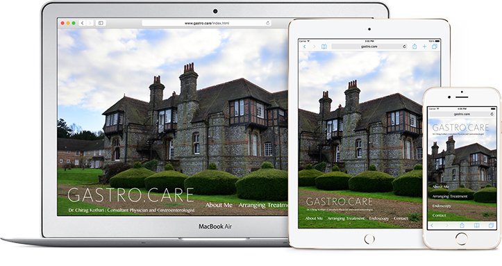
A Great Location
The hospital where Dr. Chirag practices is in a beautiful location on the outskirts of London. We wanted to portray this location to make the patients feel more at ease before they even make a visit to the hospital.
Content
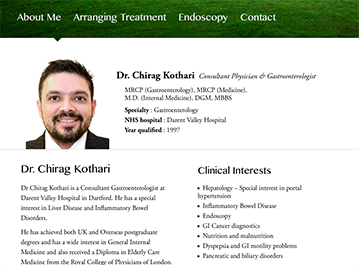
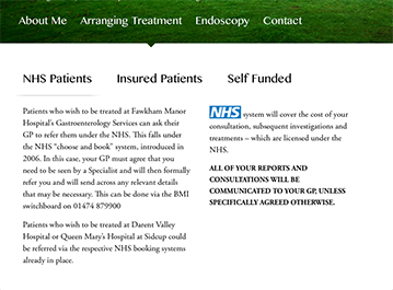
We gave headings to page sections making it easier for the visitor to quickly go through the relevant writeup. Content links were given for the “Endoscopy” section (on the right) to avoid a long vertical scroll.
Any Screen
With the popularity of mobiles and tablets there is a need for websites to feel like they were built for each device. We worked towards bringing this feel to the website. Rollover to see it
