Typography
We started this project by trying to determine the right typeface. We needed to make the identity really simple yet unique, simple so it could be used everywhere and unique so it was easily identifiable at a distance.

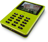
We picked ‘Chalet’ a compressed rounded looking typeface to help reinforce the shapes of the devices.
Icon Design
In trying to make a logo for Audio Compass we decided that we needed to make an icon to go along with the name. Here is the process we used to design it.
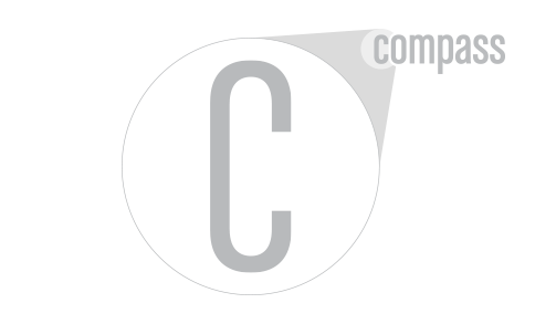
To the right is a step by step process of how we designed the logo for Audio Compass.
Keep Clicking on the graphic to see the next stepClick to move forward


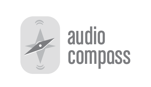
![]() Replay
Replay
Website
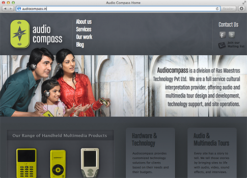
As part of our rebranding effort for Audio Compass we designed their website with the same approach.

